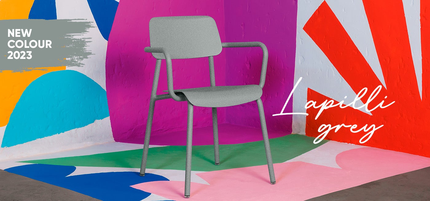
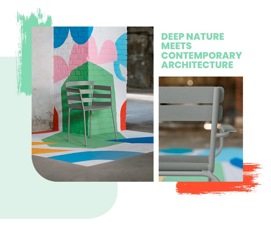
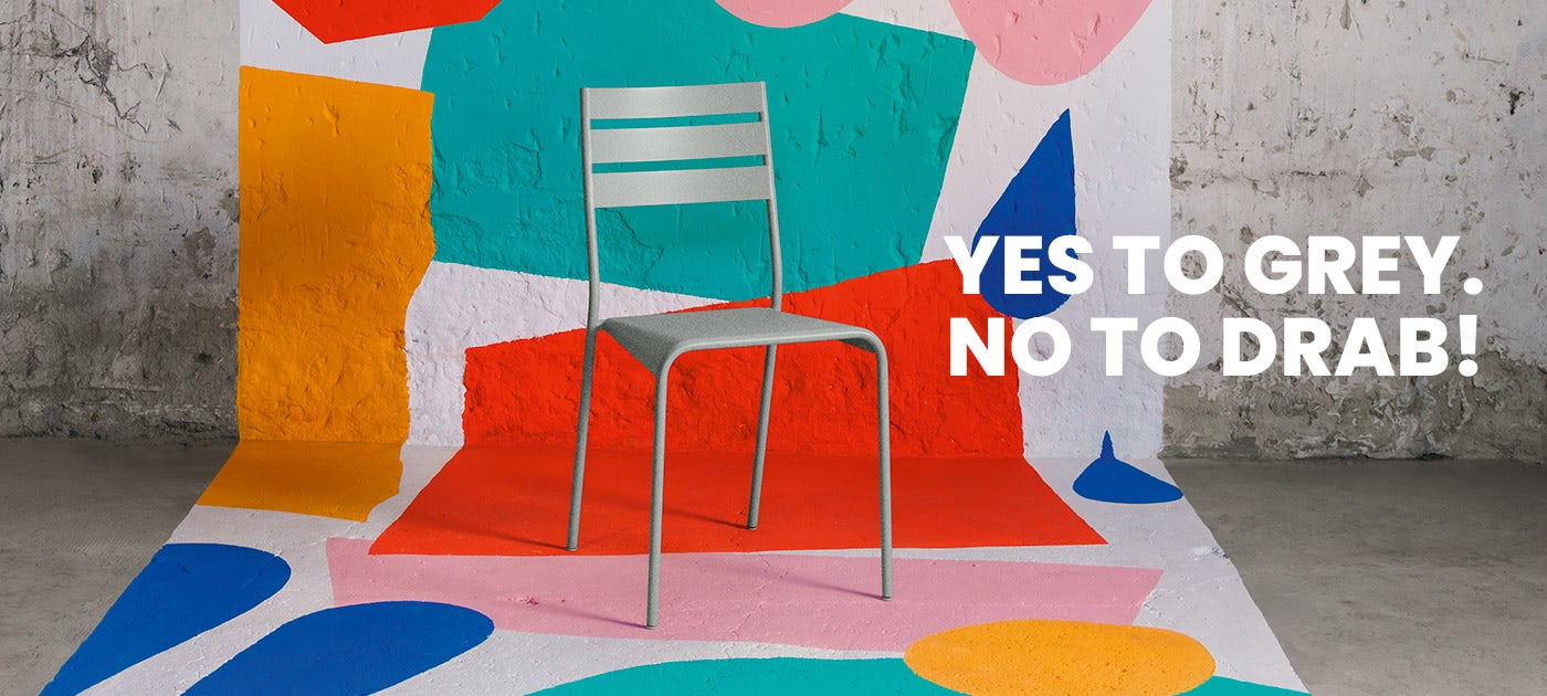
With stunning subtlety, Lapilli Grey enhances the Fermob colour chart, key to product identity and spatial design.
The fruit of an outstanding collaboration between Axalta, our long-standing paint manufacturer, and Fermob’s colour experts, this new exclusive colour has the particularity of being composed of two shades of grey. With its mottled finish, Lapilli Grey adds visual contrast to our textured finish and a new depth to your terraces.
Lapilli Grey goes well with all the colours in the colour chart, providing a sense of stability, timelessness and tranquillity.
Discover the secrets of this new colour and experience its deep nature through an artistic and unique spatial design.
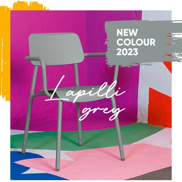
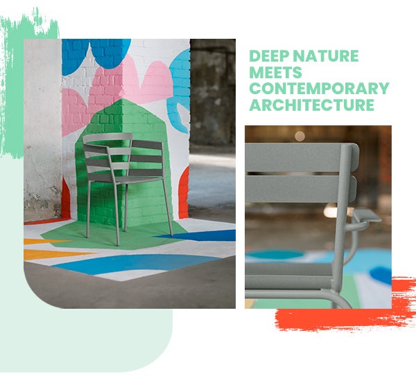
X
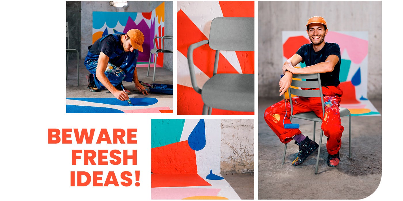
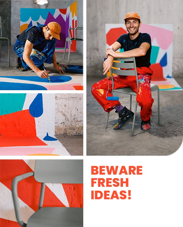
BART LANZINI
Like Fermob, Bart Lanzini, painter and visual artist, has a special relationship with colour.
Here he is with our Lapilli Grey, drawing inspiration from this industrial wasteland.
Their combination has created astonishing, flamboyant, vivid and welcoming colour combinations!
How to use and combine |
 |
How to use and combine
Lapilli Grey is a powerful colour that goes well with all the colours in the colour chart!
Discover the powers of this unique colour and its many possible ways
to pair it for the design of your spaces according to their universe.
Monochrome
Tone-matched
Combination of hues
Contrasts
When used in monochrome, Lapilli Grey reflects the current architectural movement to repurpose spaces with urban or industrial connotations.
Beautifully nestled between Storm Grey and Clay Grey, Lapilli Grey adds a subtle neutral grey tone!
Recalling nature, the combination is particularly harmonious with the range of grey-greens, Cactus and Rosemary nature.
With bright colours, the concrete aspect of Lapilli Grey softens the effect, awakening or subduing the intensity of the colours.
Monochrome
When used in monochrome, Lapilli Grey reflects the current architectural movement to repurpose spaces with urban or industrial connotations.
Tone-matched
Beautifully nestled between Storm Grey and Clay Grey, Lapilli Grey adds a subtle neutral grey tone!
Combination of hues
Recalling nature, the combination is particularly harmonious with the range of grey-greens, Cactus and Rosemary nature.
Contrasts
With bright colours, the concrete aspect of Lapilli Grey softens the effect, awakening or subduing the intensity of the colours.

Our selection |
|
Our selection
For more information, please
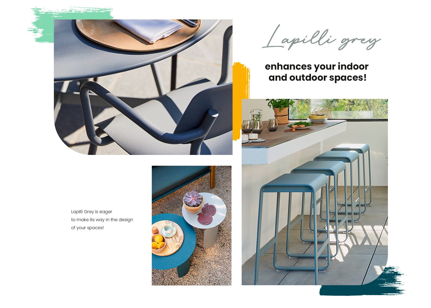
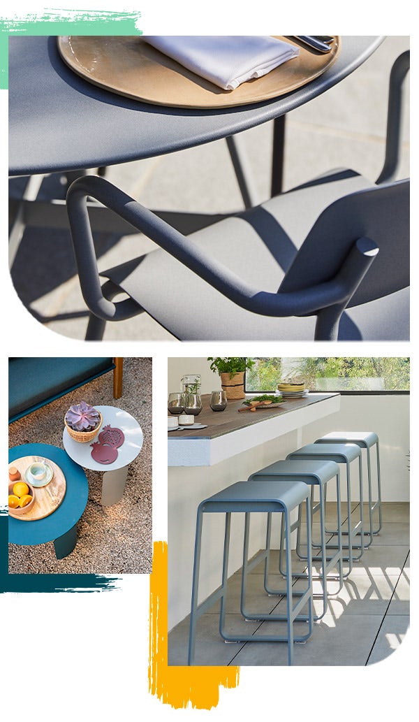
enhances your indoor
and outdoor spaces!
Lapilli Grey is eager to make its way in the design of your spaces!